
D. Pantazis, Ophthalmologist — Corporate identity
It started with a logo and became a complete image for the practice, from the card to the illuminated sign.
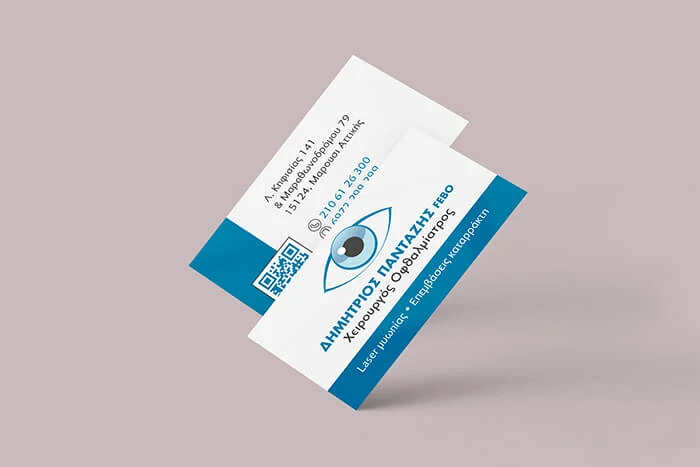
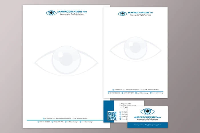
The eye mark followed the doctor’s own direction. On it we built all of the practice’s material: letterheads, notepads, business cards, and review cards with a QR code for patients.
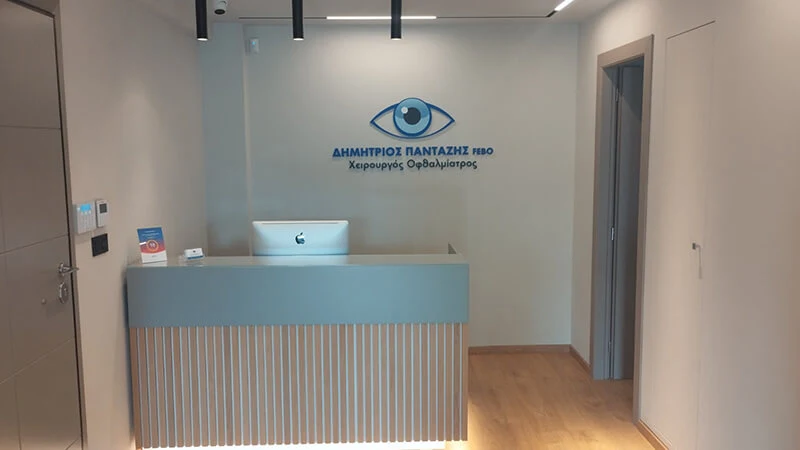
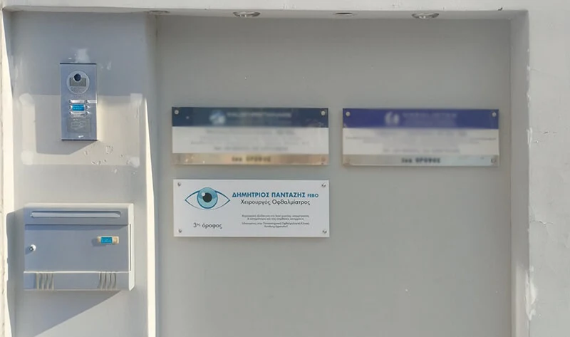
On the building, the logo appears on two 5.5-metre illuminated exterior signs and on smaller plaques, and a 3D version of it was installed at reception.
What we did
- Logo design
- A4 letterhead and A5 notepad
- Business cards
- Two 5.5-metre illuminated exterior signs
- 3D logo for reception
- Small indoor and outdoor plaques
- Review cards with a QR code